Story View
Layout
The Story View supports two layout modes that can be configured using the layout parameter.
Modern Layout
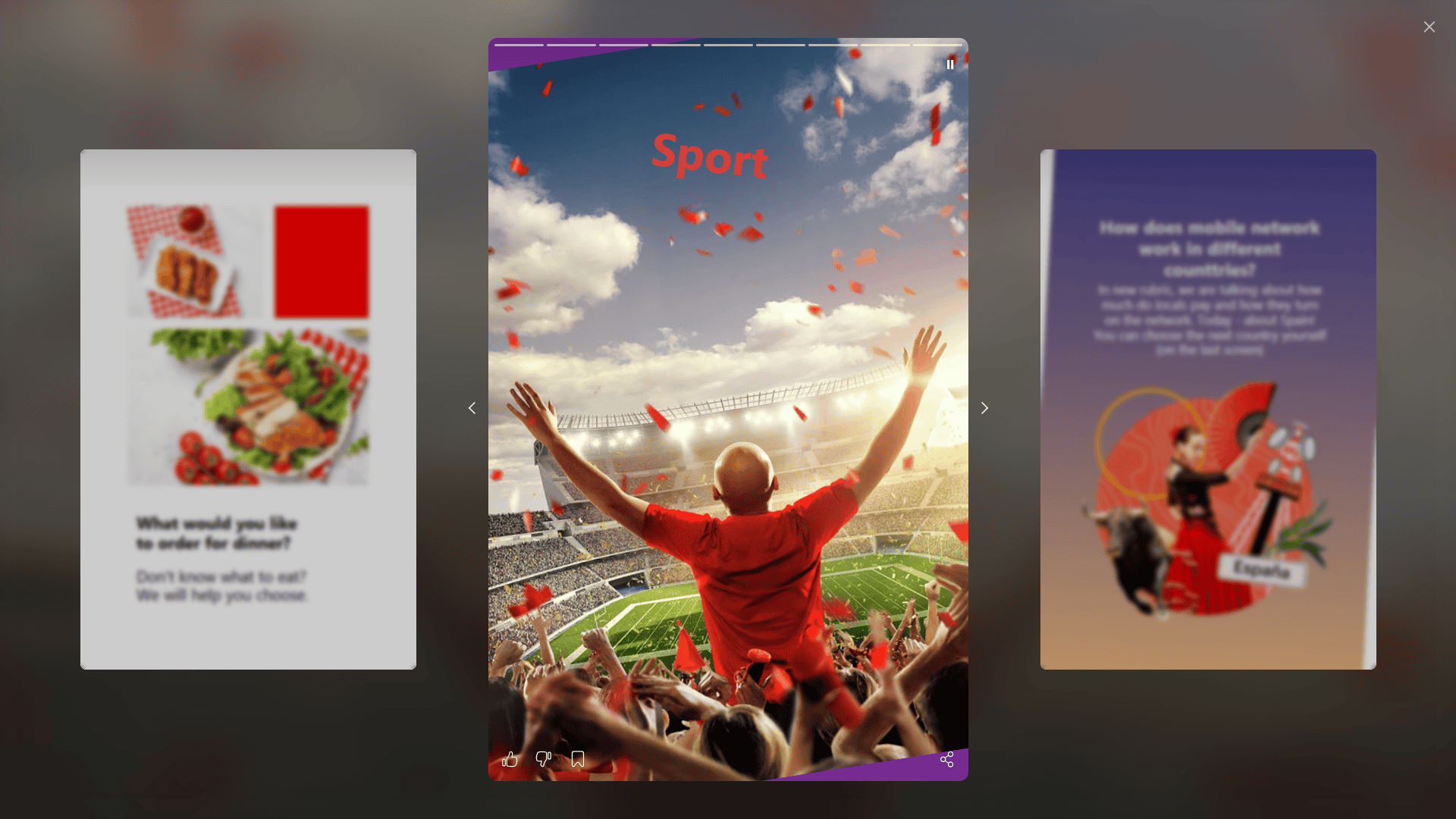
To use the modern layout, set the parameter as follows:
<IASContainer storyReaderOptions={{
    layout: StoryReaderLayout.Modern
}} />
Classic Layout
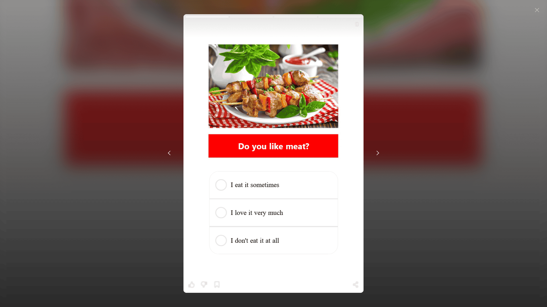
To use the classic layout, set the parameter as follows:
<IASContainer storyReaderOptions={{
    layout: StoryReaderLayout.Classic
}} />
Customization
Below are the configuration options for customizing the Story View appearance.
Common options
Common settings of the modal window for viewing story (close button, loader)
| Variable | Type | Description |
|---|---|---|
| closeButtonPosition | string | Close button position, one of start, end (for all readers). |
| closeButton | object | Close button svg icon. (for all readers) |
| loader.default.color | string | Default loader primary color. Valid css color. Default - white (for all readers) |
| loader.default.accentColor | string | Default loader accent color. Valid css color. Default - transparent (for all readers) |
<IASContainer commonOptions={{
    closeButton: {
        svgSrc: {
            baseState: "<svg>...</svg>"
        };
    }
}} />
Options
| Parameter | Type | Description |
|---|---|---|
closeButtonPosition | string | Position of the close button. Possible values: start, end. Values left and right are marked as deprecated since version 2.14.0. |
scrollStyle | string | Scroll style of the story view pager. Possible values: flat, cover, cube. |
loader.default.color | string | Primary loader color. Any valid CSS color. Default: white. |
loader.default.accentColor | string | Loader accent color. Any valid CSS color. Default: transparent. |
sharePanel | object | Share panel options. |
commonBackdrop | object | Backdrop options for the StoryReader. |
slideBackdrop | object | Backdrop options for story slides. |
timelineBlockTopOffset | number | undefined | Top offset (in px) of the timeline block. Default: 5. Expands the backdrop below the block as well. |
actionPanelBottomOffset | number | undefined | Bottom offset (in px) of the ActionPanel. Default: 0. Also increases ActionPanel height. |
closeButton | object | Override close button SVG icon. |
likeButton | object | Override like button SVG icon. |
dislikeButton | object | Override dislike button SVG icon. |
favoriteButton | object | Override favorite button SVG icon. |
muteButton | object | Override mute button SVG icon. |
shareButton | object | Override share button SVG icon. |
navigation | object | Override navigation buttons SVG icons. |
borderRadius | number | Border radius of stories in px. Default: 5. |
layout | string | Story view layout. Possible values: modern, classic. Default: classic. |
Backdrop Options
Configuration for the common backdrop.
| Parameter | Type | Description |
|---|---|---|
color | string | Backdrop color. Any valid CSS color. Example: rgba(0,0,0,.3). Default: rgba(0,0,0,1). |
backdropFilter | string | null | CSS filter for the backdrop. Example: blur(10px). Default: null. |
Story slide backdrop options
| Variable | Type | Description |
|---|---|---|
opacity | number | Slide based image backdrop - opacity value. Default .56 |
blur | number | Slide based image backdrop - blur value. Default 30 |
linearGradientOverlay | Array<string> | Slide based image backdrop - Linear gradient overlay values. Default [rgba(0, 0, 0, 0.1) 0%, rgba(0, 0, 0, 0.9) 100%] |
Example
<IASContainer storyReaderOptions={{
    scrollStyle: StoryReaderSwipeStyle.FLAT,
    timelineBlockTopOffset: 8,
    actionPanelBottomOffset: 0,
    borderRadius: 12,
    layout: StoryReaderLayout.Classic,
}} />
Action Bar
The Action Bar is a key UI element that provides quick access to core interactive features. It consists of a set of intuitive icons, each responsible for a specific action.
Actions
-
Like / Dislike
Allows the user to express positive or negative feedback about the content.
-
Add to Favorites / Remove from Favorites
Adds the content to a Favorites list for quick future access or removes it from the list.
-
Share
Opens a sharing panel:
- Desktop: bottom sheet,
- Mobile: system share menu.
-
Mute / Unmute
Controls media playback sound (video, audio, ads). Allows enabling or disabling sound instantly without interrupting playback.
Options
You can enable/disable controls using commonOptions property
<IASContainer commonOptions={{
                hasLike: true,
                hasFavorite: true,
                hasShare: true
            }} />
| Parameter | Type | Description |
|---|---|---|
hasLike | boolean | Enables the Like / Dislike action. Default false |
hasFavorite | boolean | Enables the Add to Favorites action. Default false |
hasShare | boolean | Enables the Share action. Default false |
Customization
- Customize
likeordislikebutton icon
<IASContainer storyReaderOptions={{
    likeButton: {
        svgSrc: {
            baseState: "<svg>...</svg>"
        },
    },
    dislikeButton: {
        svgSrc: {
            baseState: "<svg>...</svg>"
        },
    }
}} />
- Customize
favoritebutton icon
<IASContainer storyReaderOptions={{
    favoriteButton: {
        svgSrc: {
            baseState: "<svg>...</svg>"
        },
    }
}} />
- Customize
sharebutton icon
<IASContainer storyReaderOptions={{
    shareButton: {
        svgSrc: {
            baseState: "<svg>...</svg>"
        }
    }
}} />
- Customize action bar position
<IASContainer storyReaderOptions={{
    actionPanelBottomOffset: 20
}} />
Events
import { storyManager } from "@inappstory/react-sdk"

storyManager.on("clickOnStory", (payload) => console.log(payload));
showStorycloseStoryshowSlidelikeStorydislikeStoryfavoriteStoryshareStoryshareStoryWithPathfeedImpressionvisibleAreaUpdatedwidgetEvent
showStory
Description: Triggered when a story is opened (from slider or reader).
Payload:
| Field | Type | Description |
|---|---|---|
id | number | Story ID. |
title | string? | Story title. |
slidesCount | number? | Number of slides in the story. |
feed | string? | Feed name where the story belongs. |
source | string? | Story source. |
filter | object | Applied filters. |
ugcPayload | object | UGC-related payload. |
extraFields | object? | Custom attributes from the story payload. |
defaultListLength | number | Default list length. |
favoriteListLength | number | Favorite list length. |
closeStory
Description: Triggered when a story is closed.
Payload:
| Field | Type | Description |
|---|---|---|
id | number | Story ID. |
title | string? | Story title. |
slidesCount | number? | Number of slides in the story. |
feed | string? | Feed name where the story belongs. |
source | string? | Story source. |
filter | object | Applied filters. |
ugcPayload | object | UGC-related payload. |
extraFields | object? | Custom attributes from the story payload. |
defaultListLength | number | Default list length. |
favoriteListLength | number | Favorite list length. |
action | string | Close action (closeReaderByCloseBtn, closeReaderByEscBtn, swipeDown, swipe, lastSlideClick, auto, externalCloseReader). |
showSlide
Description: Triggered when a slide is shown.
Payload:
| Field | Type | Description |
|---|---|---|
id | number | Story ID. |
title | string? | Story title. |
slidesCount | number? | Number of slides in the story. |
feed | string? | Feed name where the story belongs. |
source | string? | Story source. |
filter | object | Applied filters. |
ugcPayload | object | UGC-related payload. |
extraFields | object? | Custom attributes from the story payload. |
defaultListLength | number | Default list length. |
favoriteListLength | number | Favorite list length. |
index | number | Slide index. |
payload | string | Slide payload. |
likeStory
Description: Triggered when a user likes/unlikes a story.
Payload:
| Field | Type | Description |
|---|---|---|
id | number | Story ID. |
title | string? | Story title. |
slidesCount | number? | Number of slides in the story. |
feed | string? | Feed name where the story belongs. |
source | string? | Story source. |
filter | object | Applied filters. |
ugcPayload | object | UGC-related payload. |
extraFields | object? | Custom attributes from the story payload. |
defaultListLength | number | Default list length. |
favoriteListLength | number | Favorite list length. |
value | boolean | true if liked, false if unliked. |
dislikeStory
Description: Triggered when a user dislikes/undislikes a story.
Payload:
| Field | Type | Description |
|---|---|---|
id | number | Story ID. |
title | string? | Story title. |
slidesCount | number? | Number of slides in the story. |
feed | string? | Feed name where the story belongs. |
source | string? | Story source. |
filter | object | Applied filters. |
ugcPayload | object | UGC-related payload. |
extraFields | object? | Custom attributes from the story payload. |
defaultListLength | number | Default list length. |
favoriteListLength | number | Favorite list length. |
value | boolean | true if disliked, false if removed. |
favoriteStory
Description: Triggered when a user adds/removes a story to favorites.
Payload:
| Field | Type | Description |
|---|---|---|
id | number | Story ID. |
title | string? | Story title. |
slidesCount | number? | Number of slides in the story. |
feed | string? | Feed name where the story belongs. |
source | string? | Story source. |
filter | object | Applied filters. |
ugcPayload | object | UGC-related payload. |
extraFields | object? | Custom attributes from the story payload. |
defaultListLength | number | Default list length. |
favoriteListLength | number | Favorite list length. |
value | boolean | true if favorited, false if removed. |
shareStory
Description: Triggered when a user clicks on story sharing.
Payload:
| Field | Type | Description |
|---|---|---|
id | number | Story ID. |
title | string? | Story title. |
slidesCount | number? | Number of slides in the story. |
feed | string? | Feed name where the story belongs. |
source | string? | Story source. |
filter | object | Applied filters. |
ugcPayload | object | UGC-related payload. |
extraFields | object? | Custom attributes from the story payload. |
defaultListLength | number | Default list length. |
favoriteListLength | number | Favorite list length. |
shareStoryWithPath
Description: Triggered after successful creation of the sharing path.
Payload:
| Field | Type | Description |
|---|---|---|
id | number | Story ID. |
title | string? | Story title. |
slidesCount | number? | Number of slides in the story. |
feed | string? | Feed name where the story belongs. |
source | string? | Story source. |
filter | object | Applied filters. |
ugcPayload | object | UGC-related payload. |
extraFields | object? | Custom attributes from the story payload. |
defaultListLength | number | Default list length. |
favoriteListLength | number | Favorite list length. |
url | string | Generated sharing URL. |
widgetEvent
Description: Triggered by widgets inside a story.
Payload:
| Field | Type | Description |
|---|---|---|
name | string | Widget name. |
data | any | Widget-specific data. |
extraFields | object? | Custom attributes from the story payload. |