Feeds
The StoriesList component allows you to display a feed of stories on your website. Use this module to integrate interactive stories into your user interface.
Use window.IAS.InAppStoryManager and window.IAS.AppearanceManager for CDN version
Quick start

<div id="stories_widget"></div>
import { AppearanceManager, InAppStoryManager } from "@inappstory/js-sdk";

const inAppStoryManager = new InAppStoryManager({ apiKey: "{projectToken}" });
const appearanceManager = new AppearanceManager();
const storiesList = new inAppStoryManager.StoriesList(
        "#stories_widget",
        appearanceManager,
        { feed: "default" }
    );
Customization
| Parameter | Type | Description |
|---|---|---|
| card | object | Story preview card item options |
| favoriteCard | object | Favorites stories card item options |
| layout | object | Story bar layout options |
| sidePadding | number | Slider side padding, px. Default 20 |
| topPadding | number | Slider top padding, px. Default 20 |
| bottomPadding | number | Slider bottom padding, px. Default 20 |
| bottomMargin | number | Slider bottom margin, px. Default 17 |
| navigation | object | Story bar navigation options |
| direction | string | Slider direction. Can be horizontal or vertical (for vertical slider). Default horizontal. |
| autoScrollOnStoryClose | boolean | Auto scroll to invisible card when closing the story reader, px. Default true |
appearanceManager.setStoriesListOptions(
  {
    card: {}
  }
)
Layout
layout property controls the slider.
| Parameter | Type | Description |
|---|---|---|
| height | number | null | Slider total height, px. 0 - for auto height. Default 0 |
| backgroundColor | string | Default transparent |
| sliderAlign | string | Horizontal align slider inside widget, variants: start, center and end. Default start. |
Preview card
Using card property you can fully customize the look of your preview cards.
| Parameter | Type | Description |
|---|---|---|
| title | object | See below |
| title.display | boolean | Determines whether to show the title or not |
| title.position | string | Title position. Variants: cardInsideTop (inside card, at top), cardInsideBottom (inside card, at bottom), cardOutsideTop (above the card) and cardOutsideBottom(under the card). Default - cardInsideBottomNote when using the cardOutsideTop or cardOutsideBottom option you must manually specify a slider layout height value. |
| title.textAlign | string | Text in title horizontal align, variants: start, center and end. Default start. |
| title.lineClamp | number | Numbers of text lines. Default 4. |
| title.padding | number | string | Number, px eq for all sides. String - valid css, for customizing each side. Default 10.6 |
| title.font | string | CSS valid font value. Override font. Default normal 1rem InternalPrimaryFont where InternalPrimaryFont - primary font, loaded in project settings. |
| gap | number | Space between cards, px. Default 10 |
| height | number | Card height, px. Default 178 |
| variant | string | Card style, one of circle, quad, rectangle. Default rectangle |
| border | object | See below |
| border.radius | number | Card border radius, px. Default 21 |
| border.color | string | Card border color, valid css. Default black |
| border.width | number | Card border width, px. Default 2 |
| border.gap | number | Space between card and border, px. Default 5 |
| border.gradient | string | Card gradient border. Default null |
| boxShadow | string | null | Card box-shadow, valid css value. Default null |
| dropShadow | string | null | Card drop-shadow, valid css value. Example - 1px 2px 8px rgba(34, 34, 34, 0.3). Default null. |
| opacity | number | Card opacity. Default null |
| mask | object | null | Card mask - overlay between card image and title. Default null |
| svgMask | object | null | Options for card overlay with svg masks. |
| opened | object | null | Contain keys: border, boxShadow, opacity, mask Apply this values (if current value not null) on card in opened state. Default all values null |
| coverQuality | string | Quality for stories list covers, variants medium, high. If not set - sdk uses high image quality. Default high. |
| coverLazyLoading | boolean | Determines whether to use lazy loading of stories list covers. Default false. |
appearanceManager.setStoriesListOptions(
  {
    card: {
      gap: 10
    }
  }
)
Preview card gradient border
You have the ability to set a gradient border for your preview cards.
| Parameter | Type | Default | Description |
|---|---|---|---|
| card.border.gradient | string? | transparent | Border background, CSS valid gradient or color |
| card.border.width | number | 2 | Card gradient border width, px |
| card.opened.border.gradient | string? | card.border.gradient | Border background, CSS valid gradient or color in opened card state. The default value is the value set in card.border.gradient |
| card.opened.border.width | number | 2 | Card gradient border width in opened card state, px |
appearanceManager.setStoriesListOptions(
    {
      card: {
      border: {
        gradient: "linear-gradient(37deg, red, blue)",
        width: 3
      },
      opened: {
        border: {
          gradient: "red",
          width: 3
        }
      }
    }
  })
Preview card mask
An overlay between card image and title. Can be a solid color:
appearanceManager.setStoriesListOptions({
    card: {
      mask: {
        color: "rgba(0,0,0,.3)";
      }
    }
})
Or a linear gradient
appearanceManager.setStoriesListOptions({
  card: {
    mask: {
        linearGradient: [
          {
            direction: "to bottom",
            points: [
              "rgba(0, 0, 0, 0) 48.74%",
              "rgba(255, 0, 0, 0.6) 75.3%",
              "rgba(255, 0, 0, 0.6) 100%",
            ],
          },
        ];
      }
  }
})
Preview card SVG mask
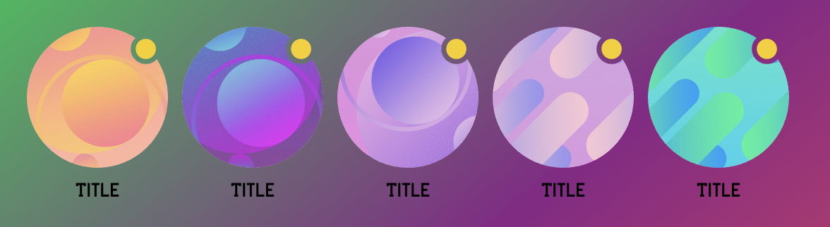
You can use SVG masks to create custom card overlay effects, like in the example below:
Options
The svgMask property allows you to configure card and overlay masks.
| Property | Type | Description |
|---|---|---|
| cardMask | string? | The base card SVG mask. Default: null. |
| overlayMask | Array<OverlayMaskItem> | An array of overlay masks applied on top of the card. Default: null. |
OverlayMaskItem
Each overlay mask item supports the following fields:
| Property | Type | Description |
|---|---|---|
| mask | string? | The SVG mask source. Default: null. |
| background | string? | A CSS color or any CSS background option. Default: null. |
Important Notes ⚠️
- The SVG mask must match the size and shape of the card.
- The transparent part of the mask cuts out the content beneath it.
- Always include the following attributes in the
<svg>tag:width="100%" height="auto" xmlns="http://www.w3.org/2000/svg"
Example
// Example: setting card and overlay masks
appearanceManager.setStoriesListOptions({
    card: {
      svgMask: {
        cardMask: `<svg width="100%" height="auto" viewBox="0 0 140 140" xmlns="http://www.w3.org/2000/svg">
    <path d="M70 140C108.66 140 140 108.66 140 70C140 56.1 135.95 43.14 128.96 32.25C126.22 35.17 122.32 37 118 37C109.72 37 103 30.28 103 22C103 17.68 104.83 13.78 107.76 11.04C96.86 4.05 83.9 0 70 0C31.34 0 0 31.34 0 70C0 108.66 31.34 140 70 140Z" fill="#B6B6B6"/>
    </svg>`,
        overlayMask: [
          {
            mask: `<svg width="100%" height="auto" viewBox="0 0 140 140" xmlns="http://www.w3.org/2000/svg">
    <path d="M128 22C128 27.52 123.52 32 118 32C112.48 32 108 27.52 108 22C108 16.48 112.48 12 118 12C123.52 12 128 16.48 128 22Z" fill="#B6B6B6"/>
    </svg>`,
            background: "#F2473D",
          },
        ],
      },
    }
});
| Card Mask | Overlay Mask |
|---|---|
 |  |
Favorite card
You can customize the appearance of the favorite card
| Parameter | Type | Description |
|---|---|---|
| title | object | See below |
| title.content | string | Card title |
| title.color | string | CSS valid color value. Default #000000 |
| title.padding | number | string | Number, px eq for all sides. String - valid css, for customizing each side. Default 15 |
| title.font | string | CSS valid font value. Override font. Default normal 1rem InternalPrimaryFont where InternalPrimaryFont - primary font, loaded in project settings. In some cases you will need to connect fonts manually |
appearanceManager.setStoriesListOptions(
  {
    favoriteCard: {
      title: {
        content: "Favorite Card"
      }
    }
  }
)
Navigation options
By default, controls are displayed as round buttons with arrow icons on the edges of the slider.
Use the navigation property to control it.
| Parameter | Type | Description |
|---|---|---|
| showControls | boolean | Enable slider controls. Default false |
| controlsSize | number | Button size, px. Default 48 |
| controlsBackgroundColor | string | CSS valid color value. Default #ffffff |
| controlsColor | string | CSS valid color value. Default #000000 |
appearanceManager.setStoriesListOptions(
  {
    navigation: {
      showControls: false
    }
  }
)
Custom loader
To add a loader to the list of stories, you can use the events provided by the StoriesList object. These events allow you to manage the loading states, such as when content starts loading and when it finishes.
startLoad— triggers when new stories start loading. You can use this event to display the loader.endLoad— triggers when the loading is complete. Use this event to hide the loader.
Example JS SDK 3
In JS SDK 3 we have abandoned the redundant use of loaderContainer. You can use directly the element to which the feed is mounted.
<div id="stories_widget"></div>
<div id="loader"></div>
import { AppearanceManager, InAppStoryManager } from "@inappstory/js-sdk";

const feed = document.getElementById("stories_widget")
const loader = document.getElementById("loader")

const inAppStoryManager = new InAppStoryManager({ apiKey: "{projectToken}" });
const appearanceManager = new AppearanceManager();
const storiesList = new inAppStoryManager.StoriesList("#stories_widget", appearanceManager);
// Show the loader when loading starts
storiesList.on("startLoad", () => {
  // Hide feed
  feed.style.display = "none";
  // Display the loader animation
  loader.style.display = "block";
});

// Hide the loader when loading finishes
storiesList.on("endLoad", (status) => {
  // Display feed
  feed.style.display = "block";
    // Remove the loader animation
  loader.style.display = "none";
  console.log({ status }); // Log the status of the loading event
});
The code in this section listens for the startLoad and endLoad events of the stories feed widget. When loading begins, the code adds an animation (loader), and when loading finishes, the animation is removed.
- The
statusparameter in theendLoadevent provides additional information about the loading process and can be logged or used for further actions.
Example JS SDK 2 (legacy)
<div id="stories_widget"></div>
const storyManager = new window.IAS.StoryManager(storyManagerConfig);
const storiesList = new storyManager.StoriesList("#stories_widget", appearanceManager);

// Show the loader when loading starts
storiesList.on("startLoad", (loaderContainer) => {
  // Display the loader animation
  loaderContainer.style.background = 'url("https://inappstory.com/stories/loader.gif") center / 45px auto no-repeat transparent';
});

// Hide the loader when loading finishes
storiesList.on("endLoad", (loaderContainer, status) => {
  // Remove the loader animation
  loaderContainer.style.background = "none";
  console.log({ status }); // Log the status of the loading event
});
The code in this section listens for the startLoad and endLoad events of the stories feed widget. When loading begins, the code adds an animation (loader), and when loading finishes, the animation is removed.
- The
loaderContainerparameter represents the container where the loader is applied. - The
statusparameter in theendLoadevent provides additional information about the loading process and can be logged or used for further actions.
Reload stories
You can use the story list API to reload the feed. For example, after changing tags:
<div id="stories_widget"></div>
import { AppearanceManager, InAppStoryManager } from "@inappstory/js-sdk";

const inAppStoryManager = new InAppStoryManager({ apiKey: "{projectToken}" });
const appearanceManager = new AppearanceManager();
const storiesList = new inAppStoryManager.StoriesList(
  "#stories_widget",
  appearanceManager
);

inAppStoryManager.setTags(["tag1", "tag2", "tagN"]);
storiesList.reload();
Grid view
The StoriesList supports a Grid View mode, providing users with a visually engaging way to browse their favorite stories. The Grid View is responsive and adapts to different screen sizes and orientations, ensuring a consistent experience across devices such as desktops, tablets, and smartphones.
To enable the Grid View display mode you need to use the direction property from stories list options. See the example below.
<div id="stories_widget"></div>
import { AppearanceManager, InAppStoryManager } from "@inappstory/js-sdk";

const inAppStoryManager = new InAppStoryManager({ apiKey: "{projectToken}" });
const appearanceManager = new AppearanceManager();
appearanceManager.setStoriesListOptions({
    direction: "vertical",
    layout: { height: 300 /* Height of story list */ }
})
const storiesList = new inAppStoryManager.StoriesList(
        "#stories_widget",
        appearanceManager,
        { feed: "default" }
    );
Making responsive
This guide demonstrates how to create a responsive story list using the @inappstory/js-sdk package by leveraging the matchMedia() Window method. This approach allows you to adjust the appearance of story cards based on the screen size, enhancing the user experience across different devices.
<div id="stories_widget"></div>
import { AppearanceManager, InAppStoryManager } from "@inappstory/js-sdk";

const inAppStoryManager = new InAppStoryManager({ apiKey: "{projectToken}" });
const appearanceManager = new AppearanceManager();
const storiesList = new inAppStoryManager.StoriesList(
        "#stories_widget",
        appearanceManager,
        { feed: "default" }
    );

 const updateStoriesListOptions = (isDesktop: boolean) => {
    const options = isDesktop ? {
        card: { height: 178 }
    } : {
        card: { height: 100 }
    };
    appearanceManager.setStoriesListOptions(options)
 }

 const updateMatches = (event: MediaQueryListEvent) => {
      updateStoriesListOptions(event.matches)
 };

 const mediaQueryList =  window.matchMedia('(min-width: 1024px)'); // Determine if the device is a desktop based on screen width
 mediaQueryList.addEventListener('change', updateMatches);
 updateStoriesListOptions(mediaQueryList.matches);
Events
import { InAppStoryManager } from "@inappstory/js-sdk"

const inAppStoryManager = new InAppStoryManager({ apiKey: "{projectToken}" });
inAppStoryManager.on("feedimpression", (payload) => console.log(payload));
feedImpression
Description: Triggered after stories appear in the viewport.
Payload:
| Field | Type | Description |
|---|---|---|
feed | string | Feed name. |
stories | array | Array of stories { id: number; title: string; slidesCount: number }. |
visibleAreaUpdated
Description: Triggered when the visible area of stories is updated in the viewport.
Payload:
| Field | Type | Description |
|---|---|---|
feed | string | Feed name. |
stories | array | Array of stories { id: number; title: string; slidesCount: number }. |
clickOnStory
Description: Triggered when a user clicks on a story card in the slider list.
Payload:
| Field | Type | Description |
|---|---|---|
id | number | Story ID. |
title | string? | Story title. |
slidesCount | number? | Number of slides in the story. |
feed | string? | Feed name where the story belongs. |
source | string? | Story source. |
filter | object | Applied filters. |
ugcPayload | object | UGC-related payload. |
defaultListLength | number | Default list length. |
favoriteListLength | number | Favorite list length. |
index | number | Index of the story in the list. |
isDeeplink | boolean | Whether the story was opened via deeplink. |
url | string? | Deeplink URL. |